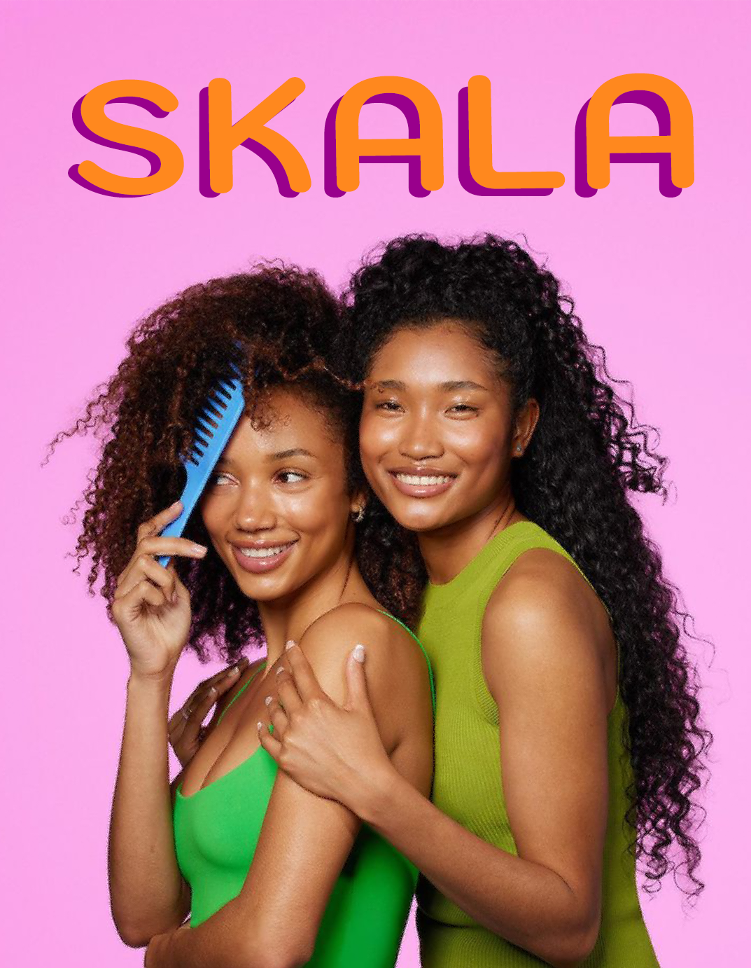
SKALA is a mass-market Brazilian haircare brand known for vegan and affordable products, particularly aimed at textured and curly hair. The project analyzes the brand’s existing visual challenges such as inconsistent layouts and weak hierarchy and proposes a structured redesign that strengthens brand recognition across product lines.
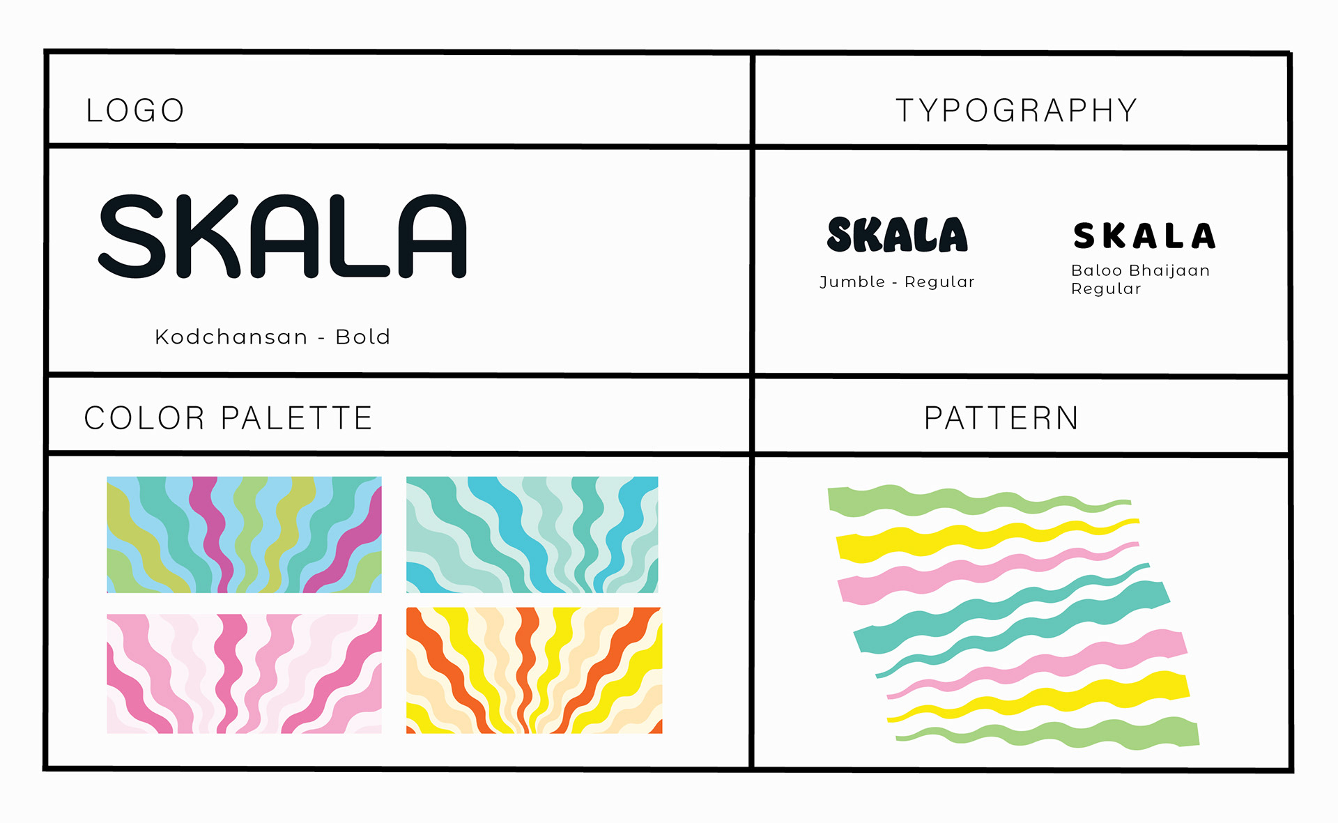
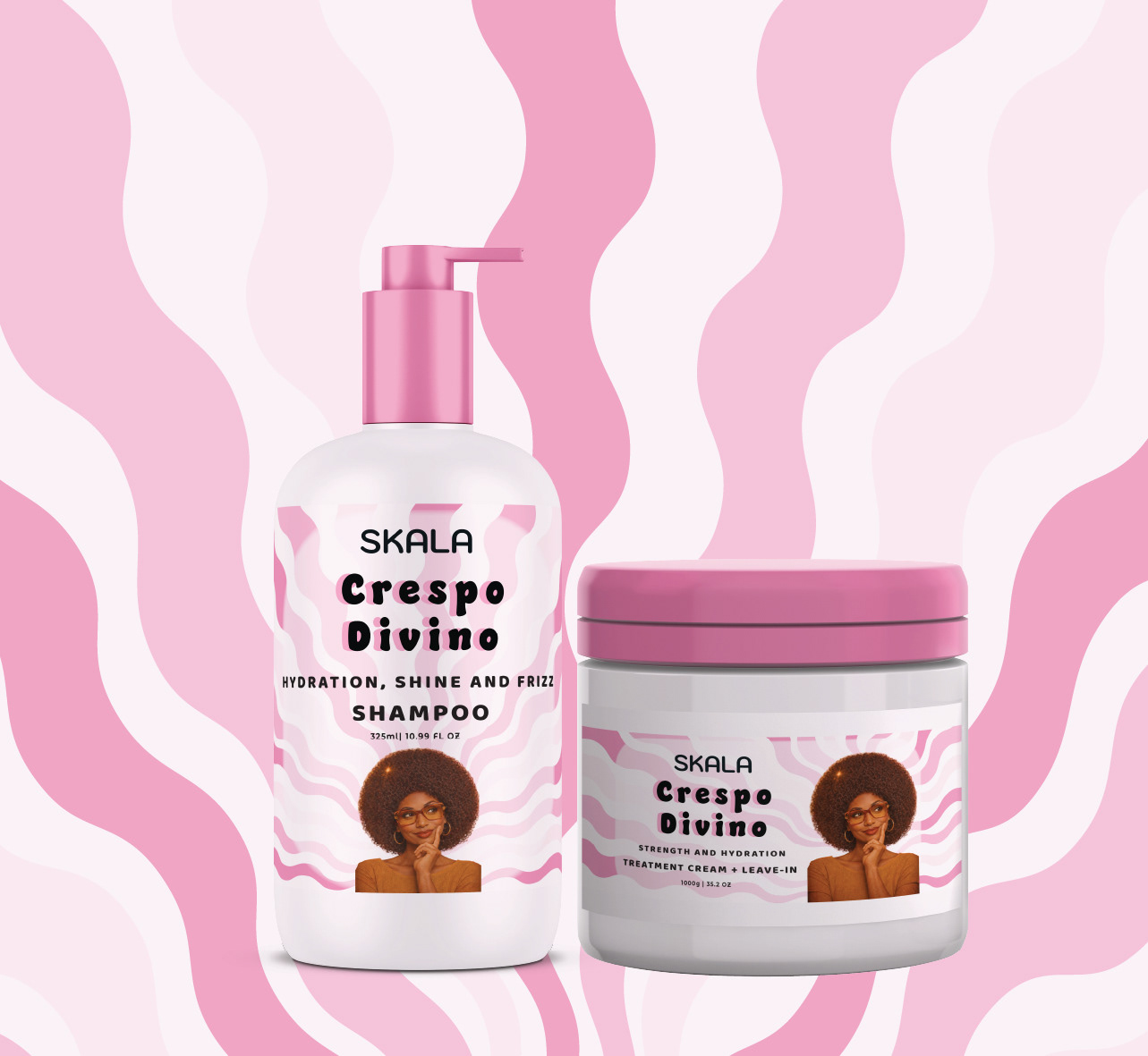
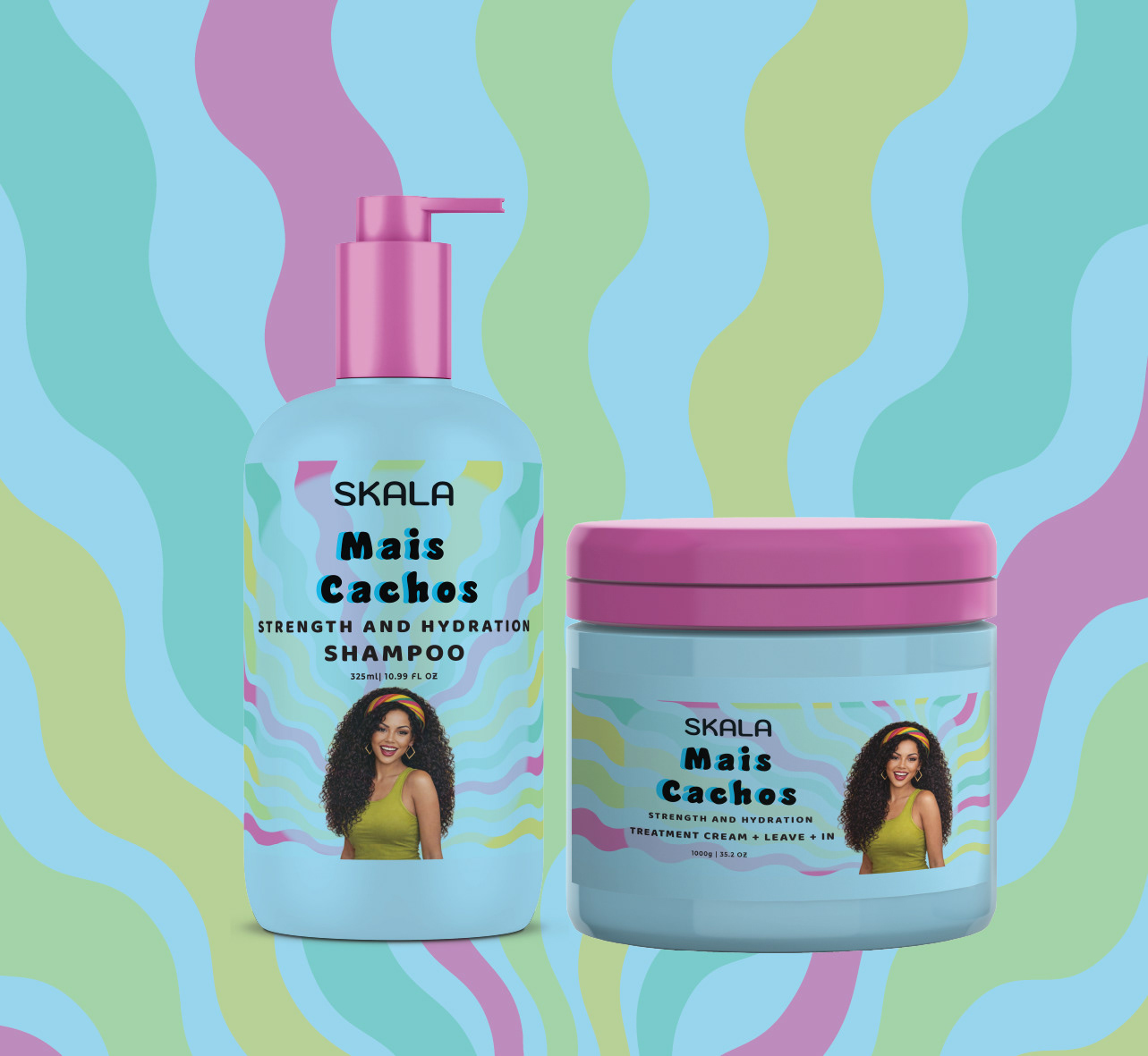
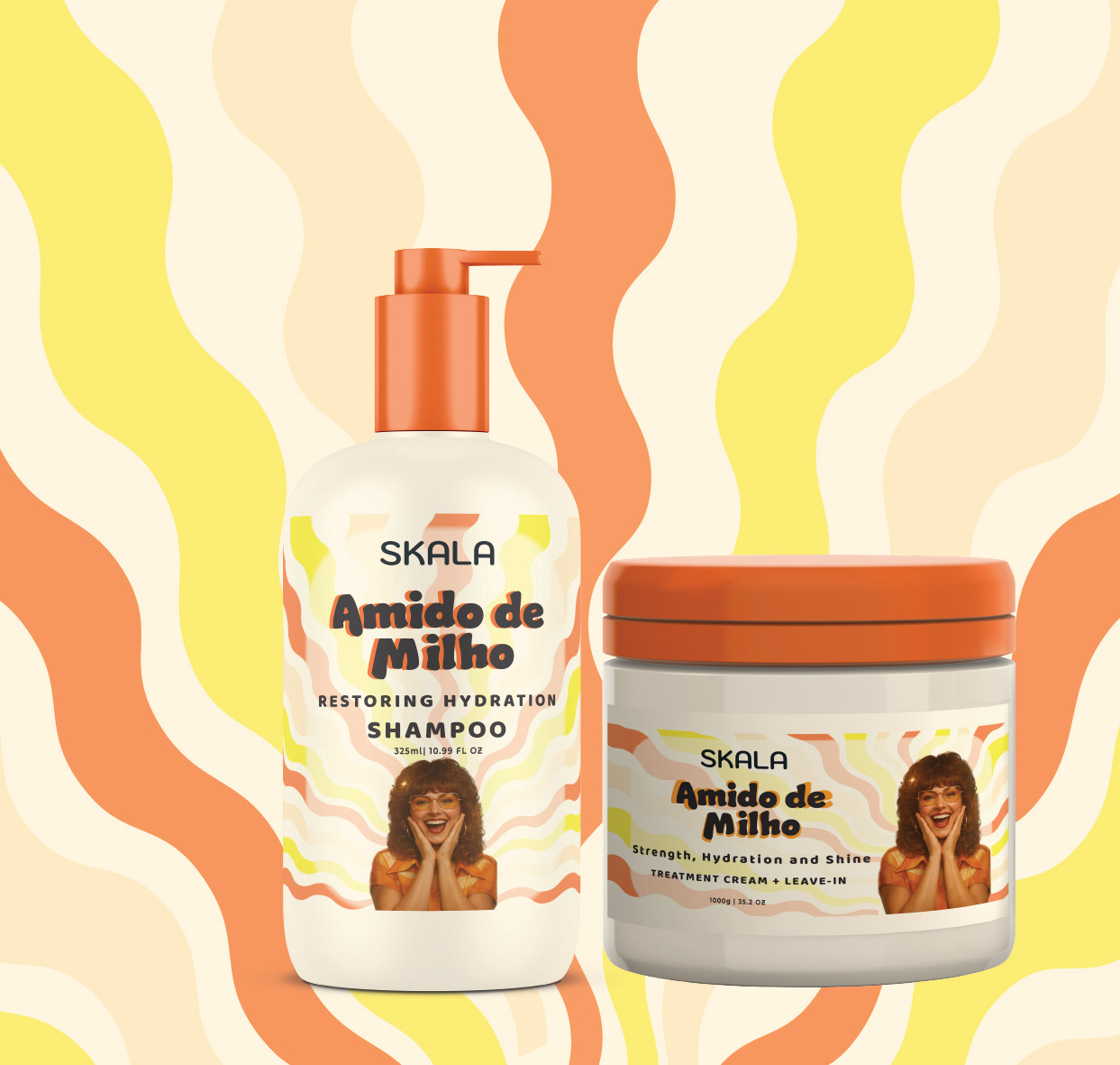
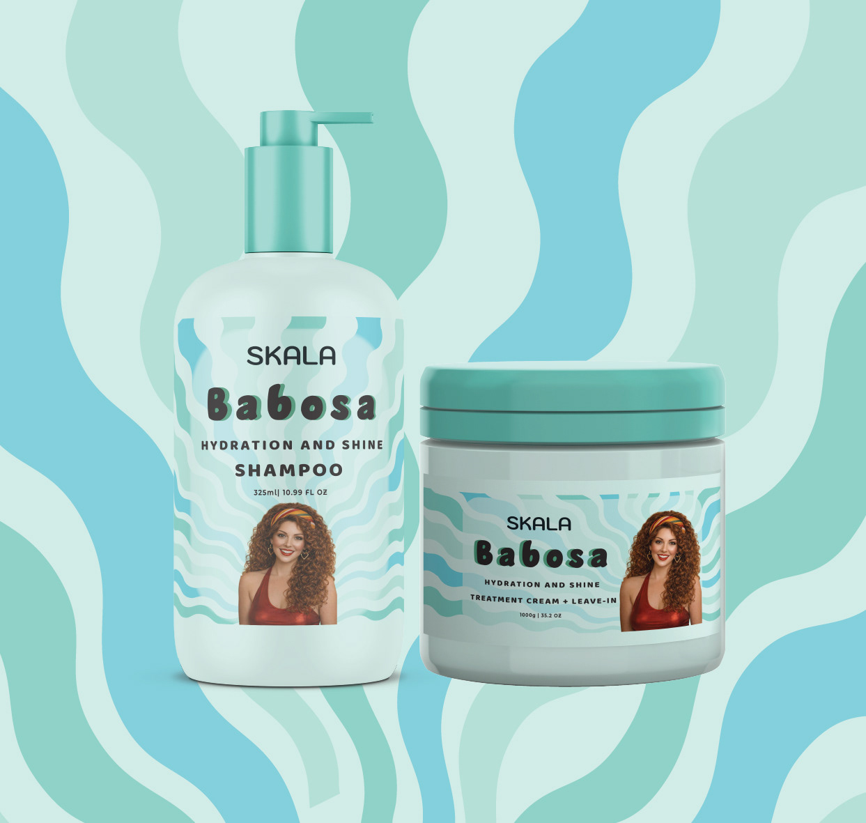
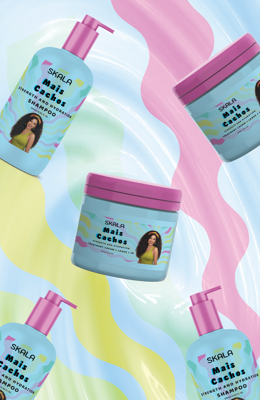
The new identity is built around rhythm, movement, and color, inspired by Brazilian visual culture from the 1970s and 1980s. Organic wave patterns reference hair texture while functioning as a flexible graphic system applied across packaging, retail displays, and communication materials.
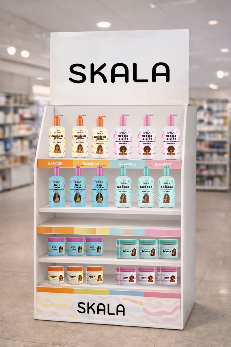
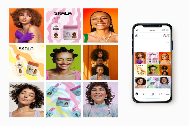
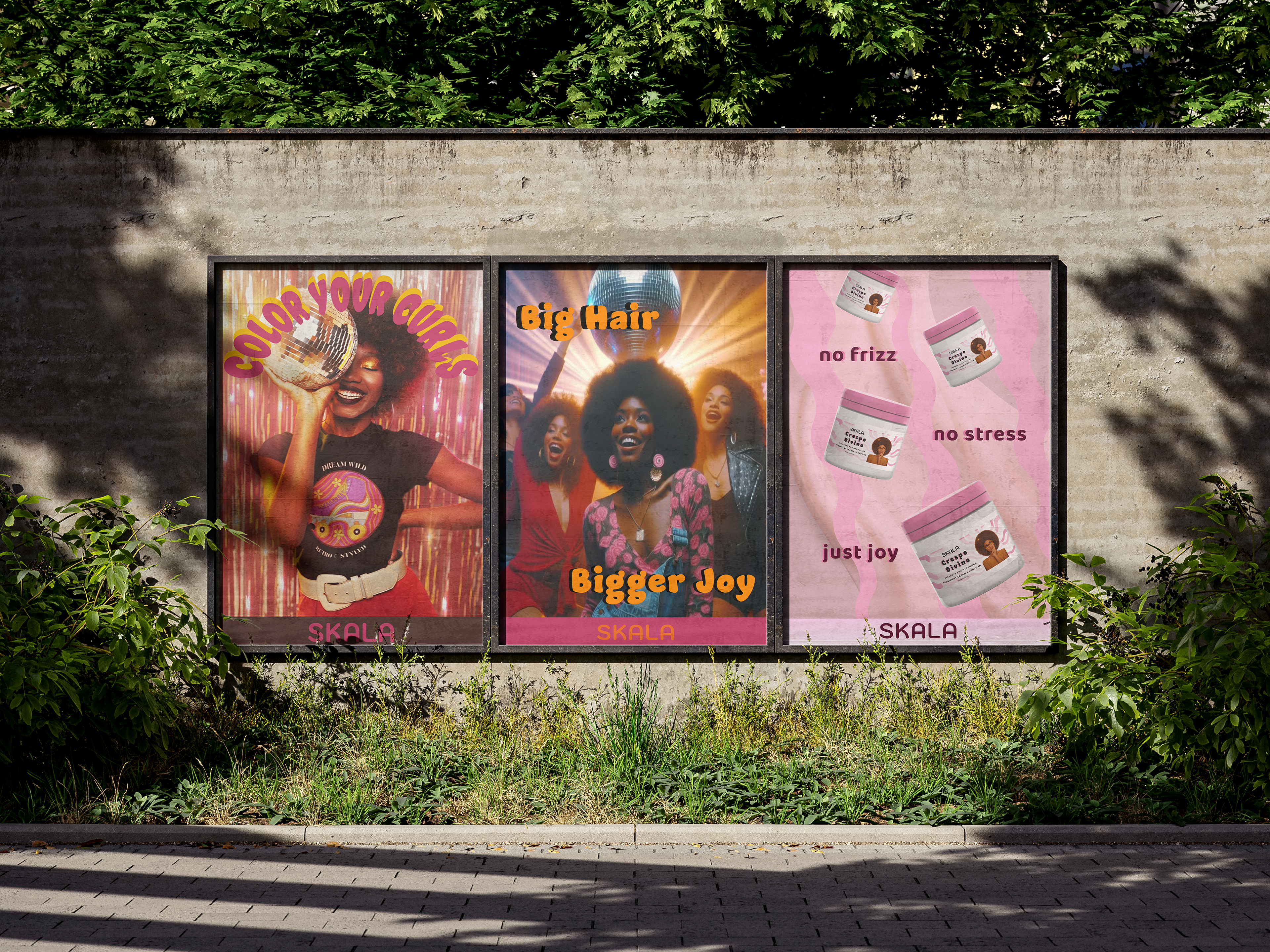
The redesign introduces a scalable visual language including updated packaging, retail stands, posters, social media content, and a website interface demonstrating how a coherent identity system can operate across multiple touchpoints while maintaining a vibrant and inclusive brand personality.
Key Elements
- Brand analysis and design strategy
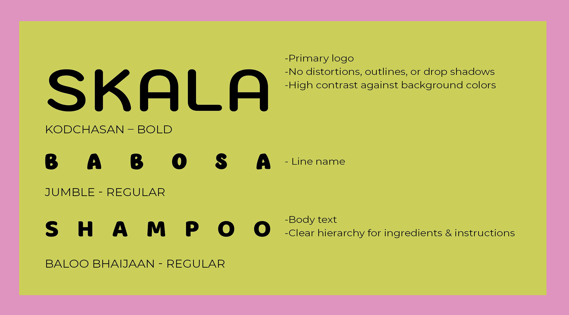
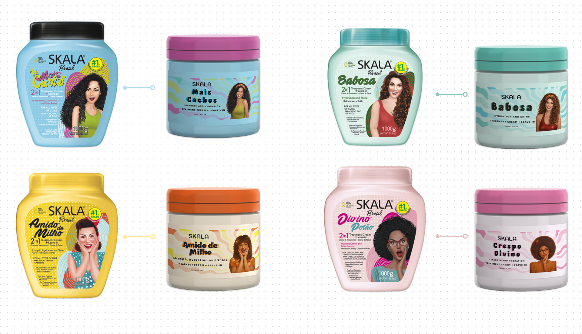
- Logo refinement and typographic hierarchy
- Pattern-based visual system
- Color coding across product lines
- Packaging redesign
- Retail displays and promotional materials
- Digital and social media applications