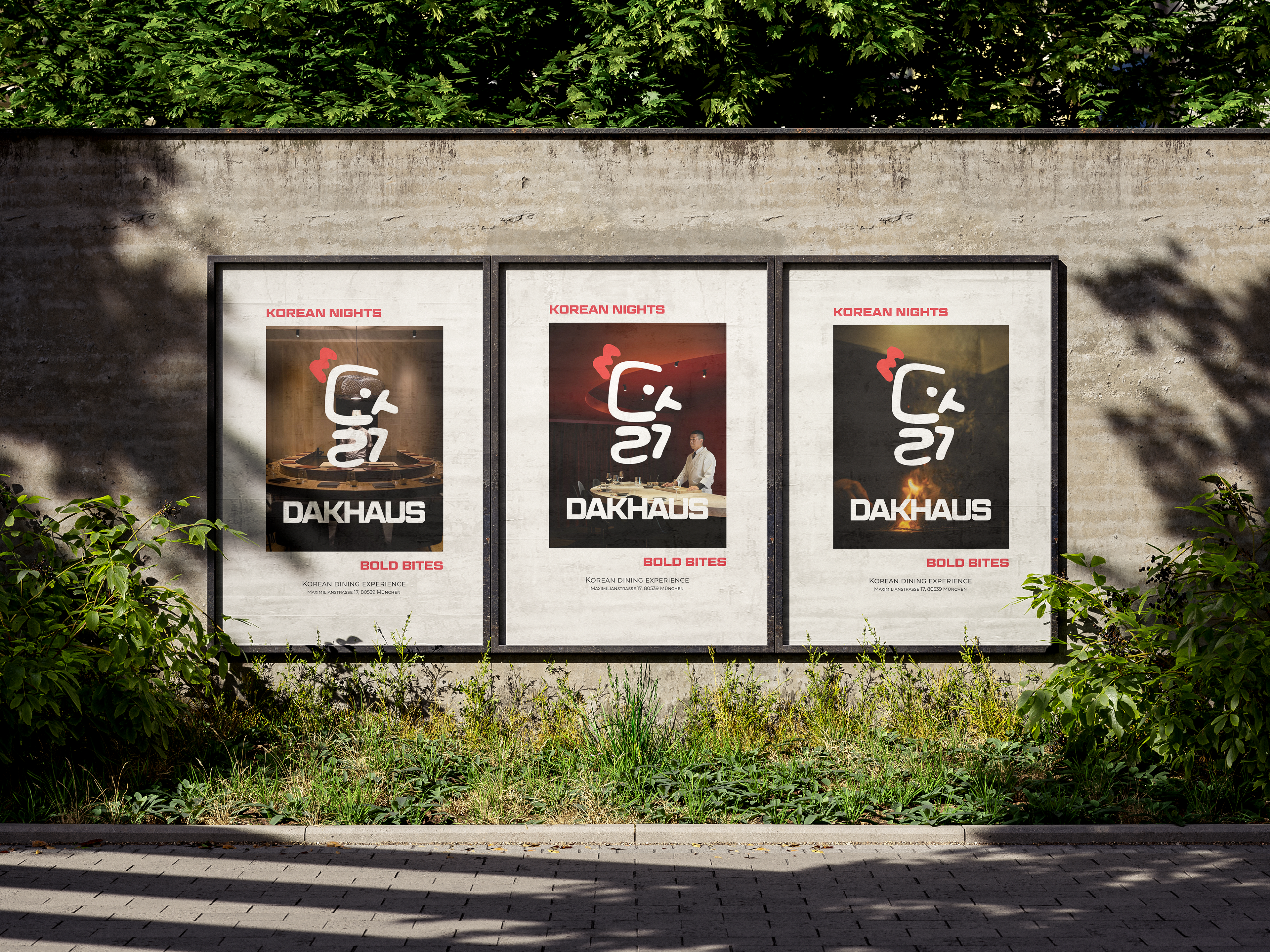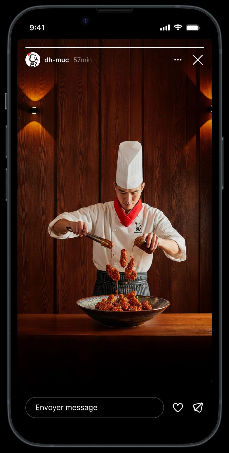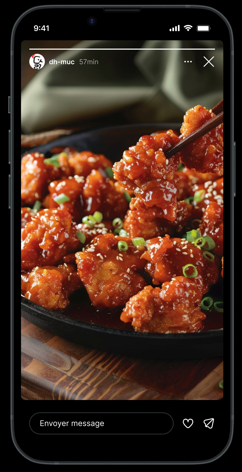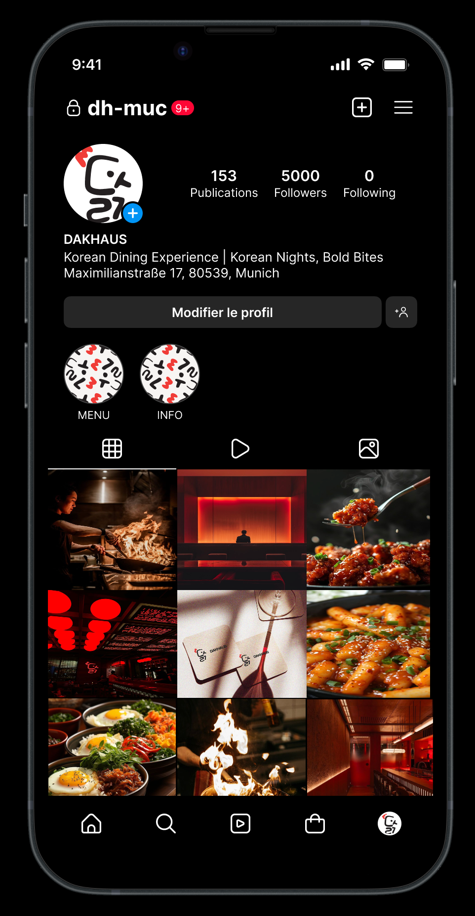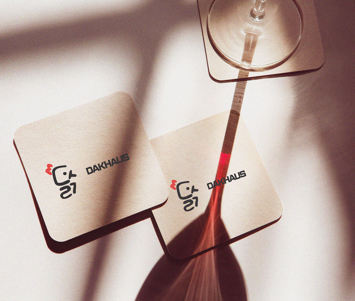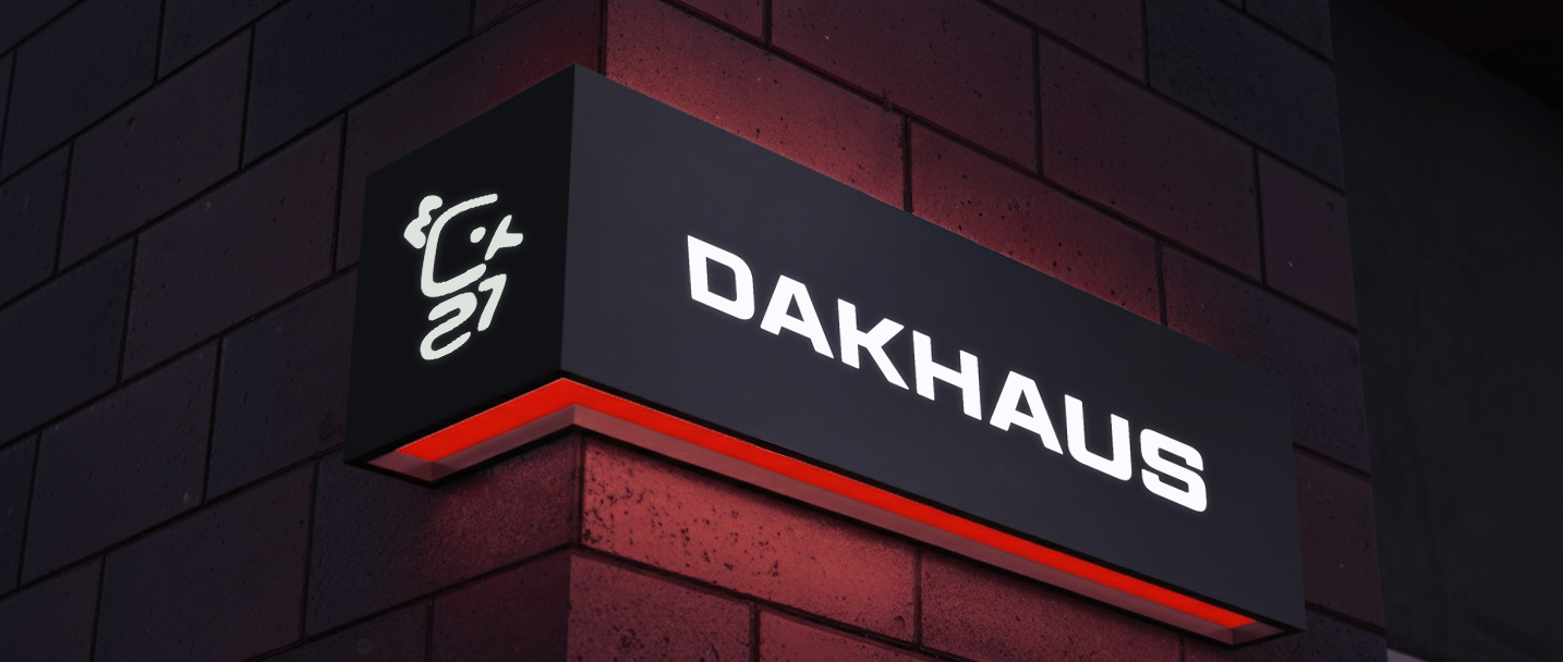
DAKHAUS is a brand identity concept for a Korean fried chicken restaurant based in Munich. The project explores how cultural references, food culture, and nightlife aesthetics can merge into a cohesive visual identity. The name combines the Korean word “dak” (chicken) with the German word “haus,” reflecting the restaurant's fusion of Korean cuisine and its Munich context. The branding translates the bold, energetic character of Korean street food culture into a contemporary and recognizable restaurant identity.
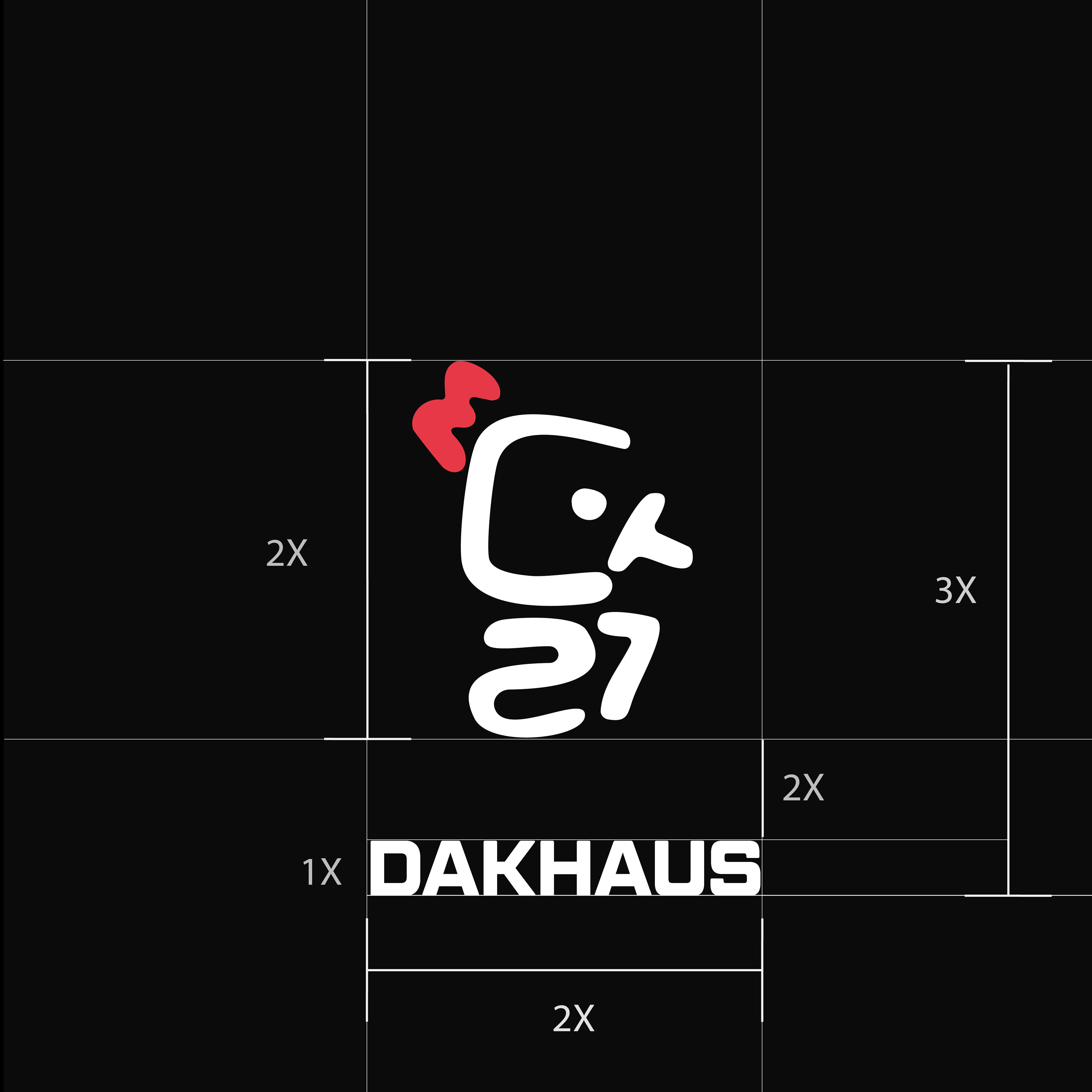
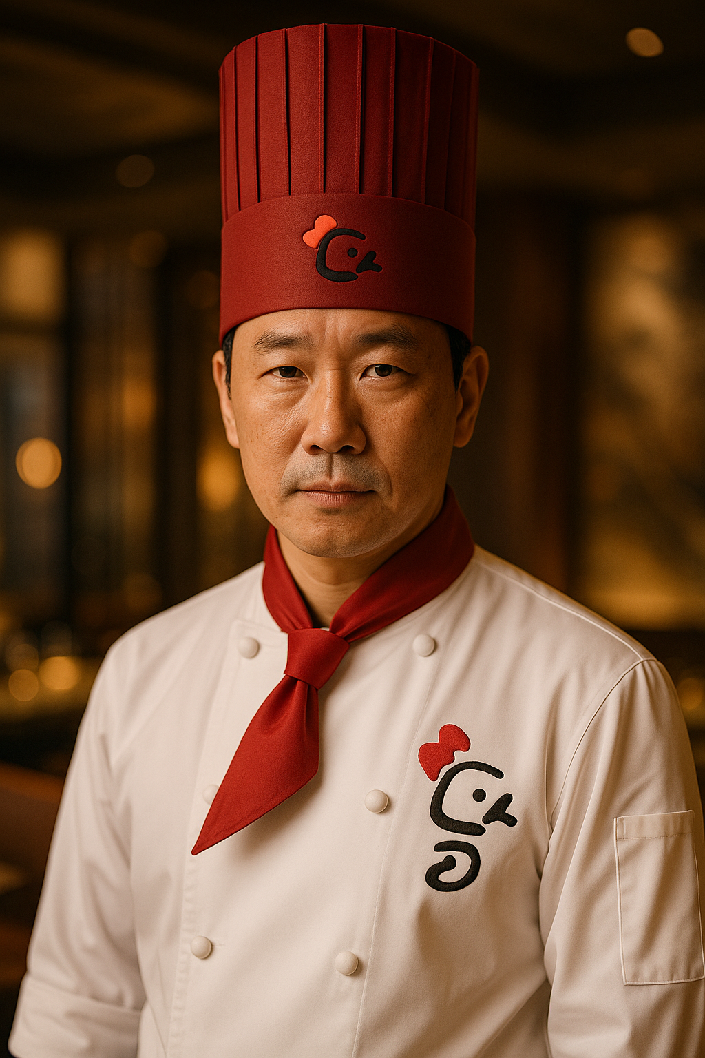
The logo visually references the concept as well, incorporating graphic elements inspired by the form and symbolism of a chicken, reinforcing the restaurant's specialty in a playful but minimal way.
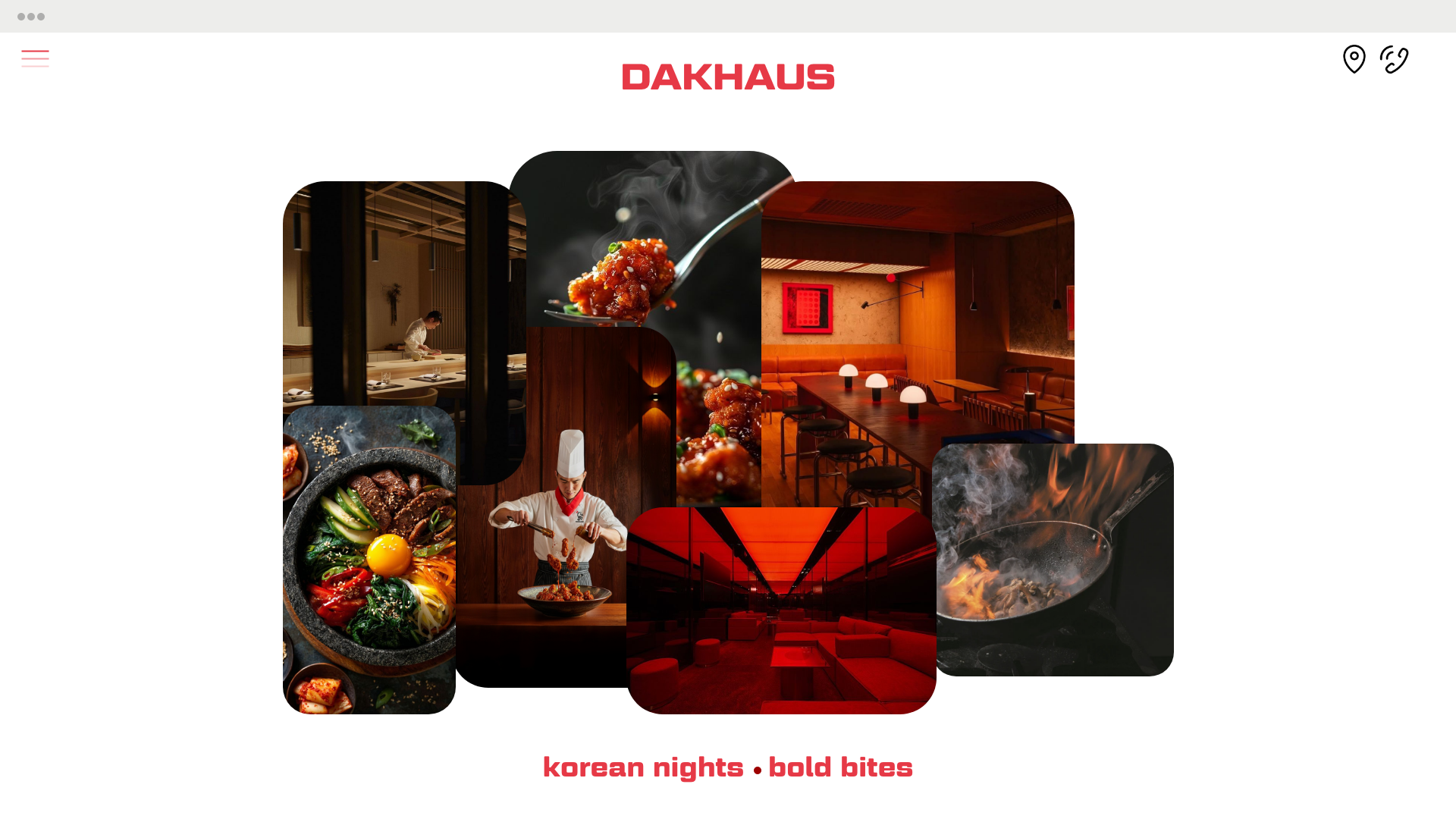
DAKHAUS is a fictional restaurant concept specializing in Korean fried chicken, designed as a vibrant dining destination in Munich. The project began with the brief to create a brand identity for a contemporary Korean restaurant that communicates both the playful energy of Korean street food culture and the urban context of the city.
The name DAKHAUS combines two cultural references:
Dak (닭), the Korean word for chicken, referencing the restaurant's main dish.
Haus, the German word for house, situating the concept within Munich and signaling a welcoming food destination.
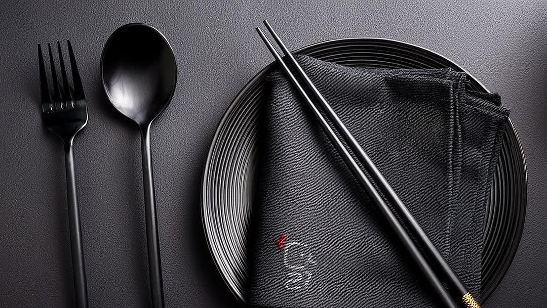
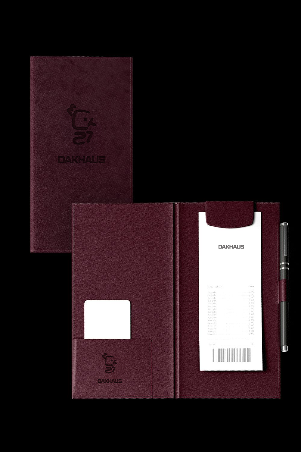
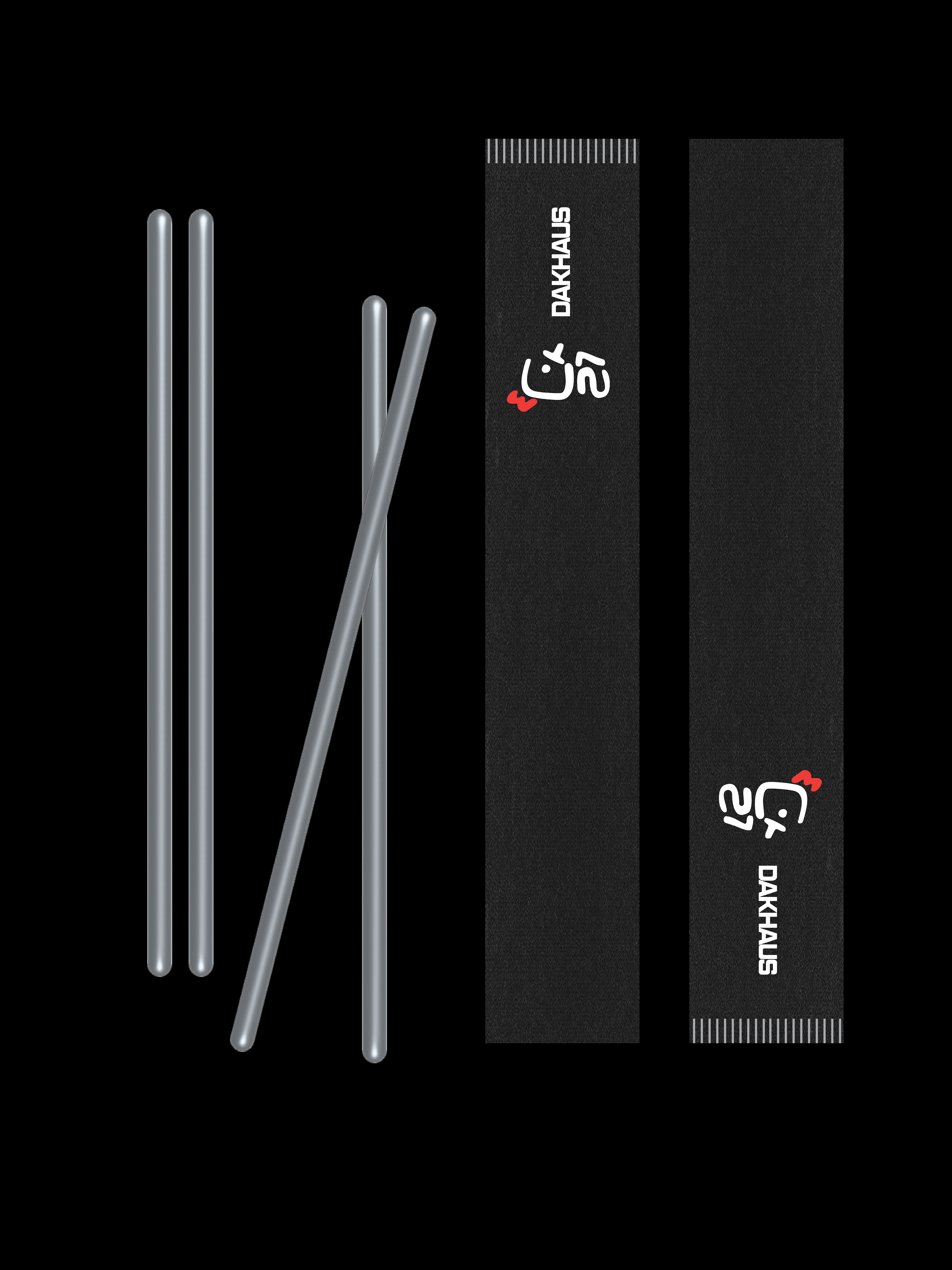
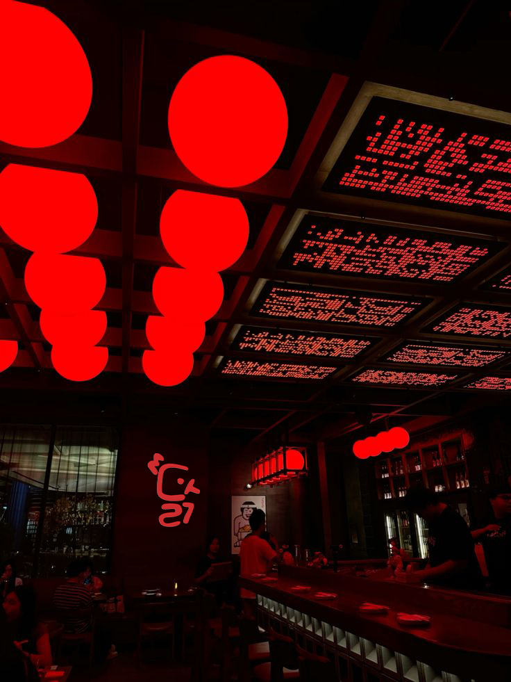
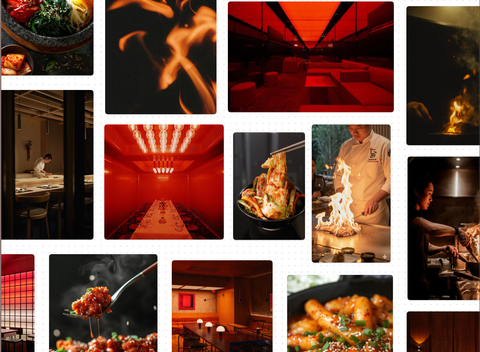
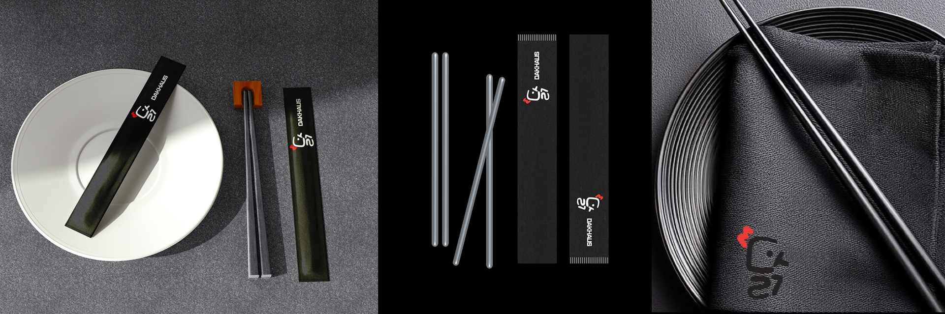
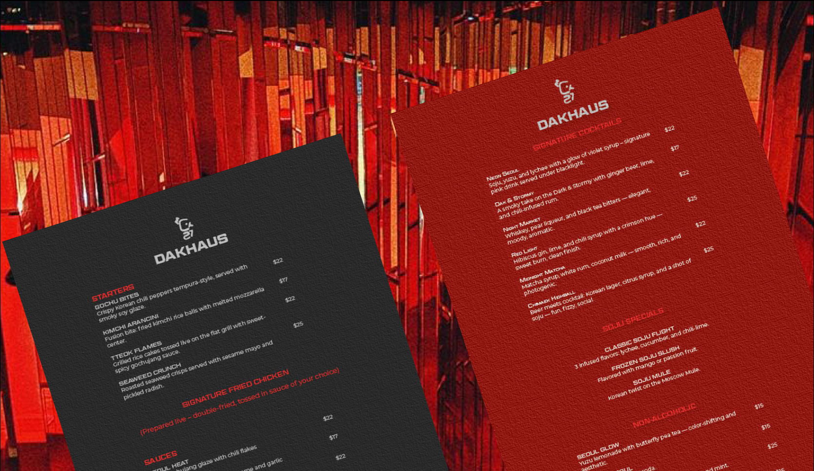
The visual identity blends industrial minimalism with bold graphic accents, creating a brand that feels contemporary, energetic, and memorable. A high-contrast color palette, expressive typography, and modular graphic elements were developed to function across multiple brand touchpoints including menus, packaging, signage, and digital interfaces.
The project demonstrates how a hospitality brand can communicate cultural identity, atmosphere, and product focus through a coherent design system.
Key Elements
- Brand concept and naming strategy
- Logo design inspired by chicken symbolism
- Typography and color system
- Menu and packaging design
- Restaurant signage and environmental branding
- Digital applications and brand extensions