This editorial publication presents Mestiza Sans, a multilingual typeface family designed by Lechuga Type, through a narrative-driven specimen book.
The project explores how typography can communicate cultural identity by blending historical references, tropical textures, and contemporary editorial design.
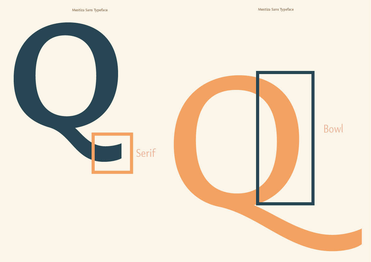
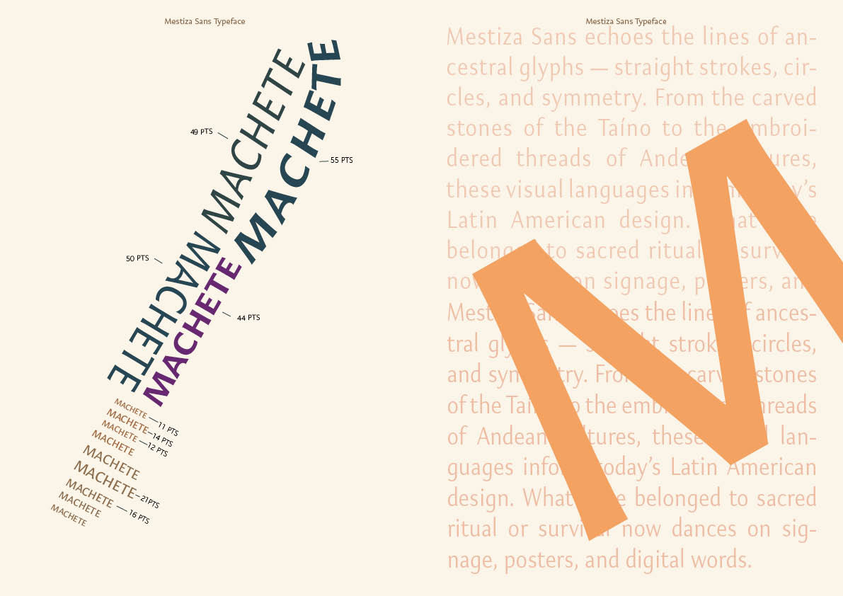
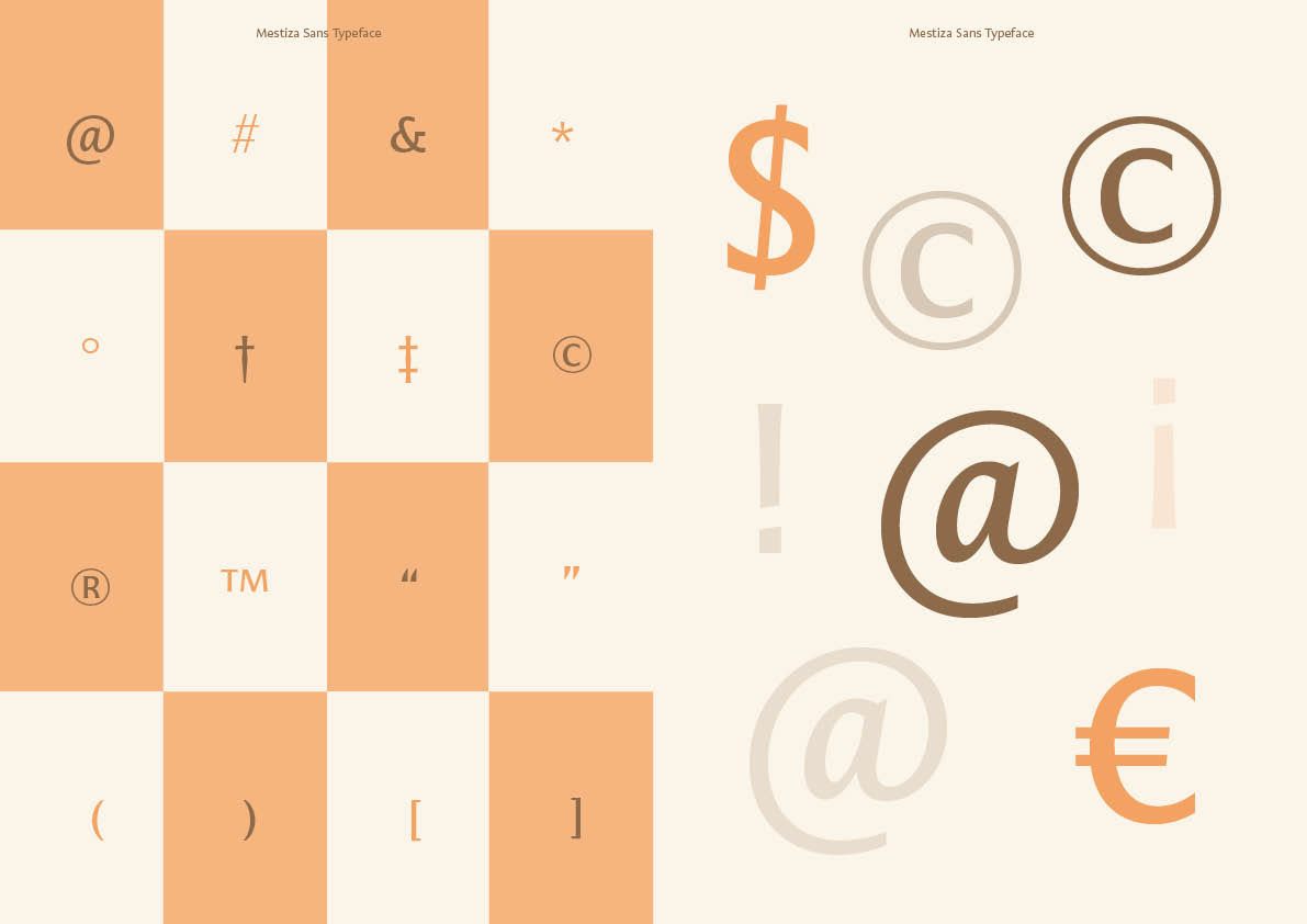
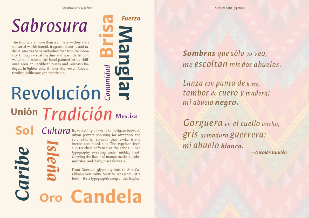
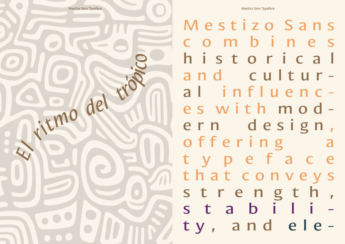
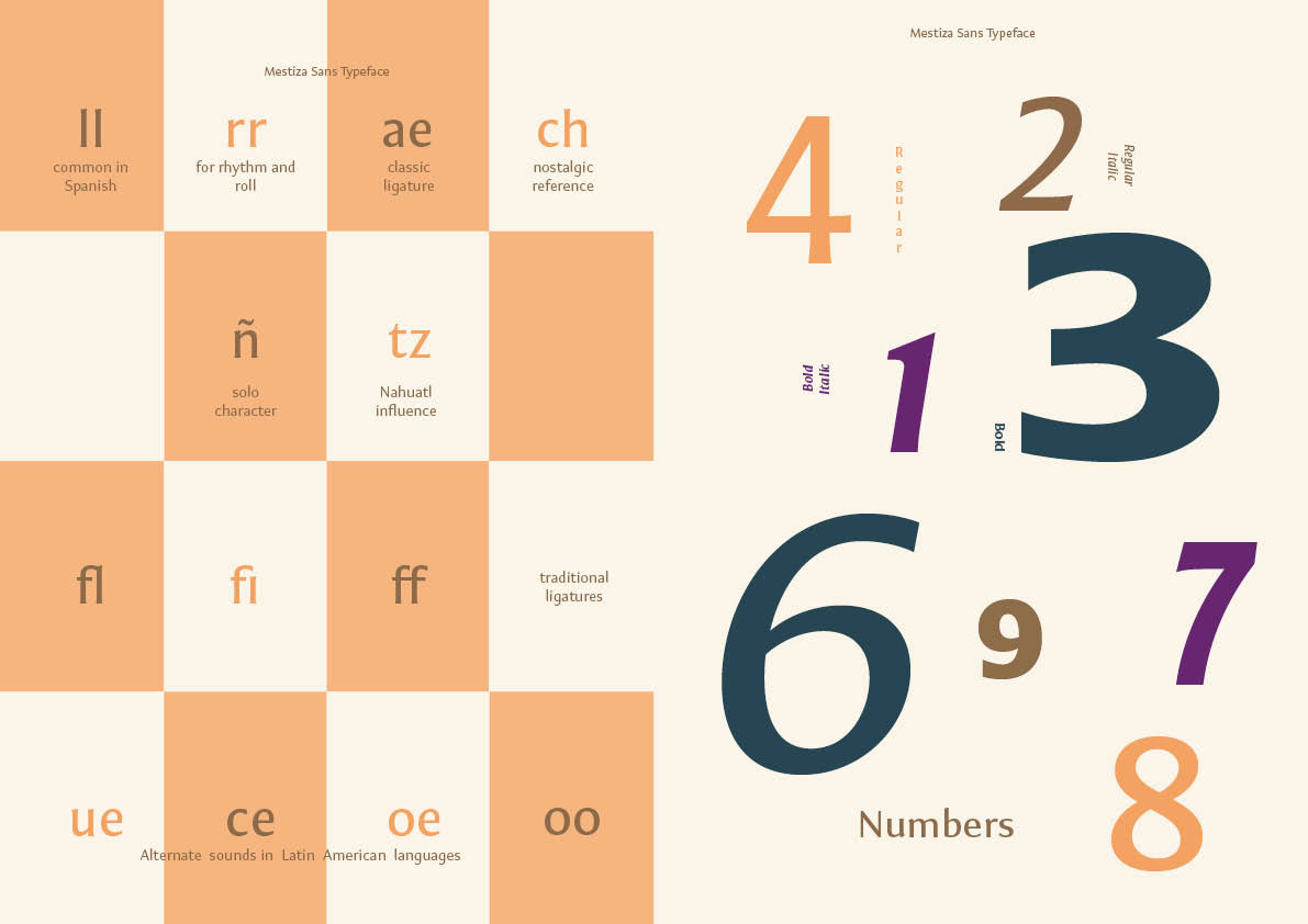
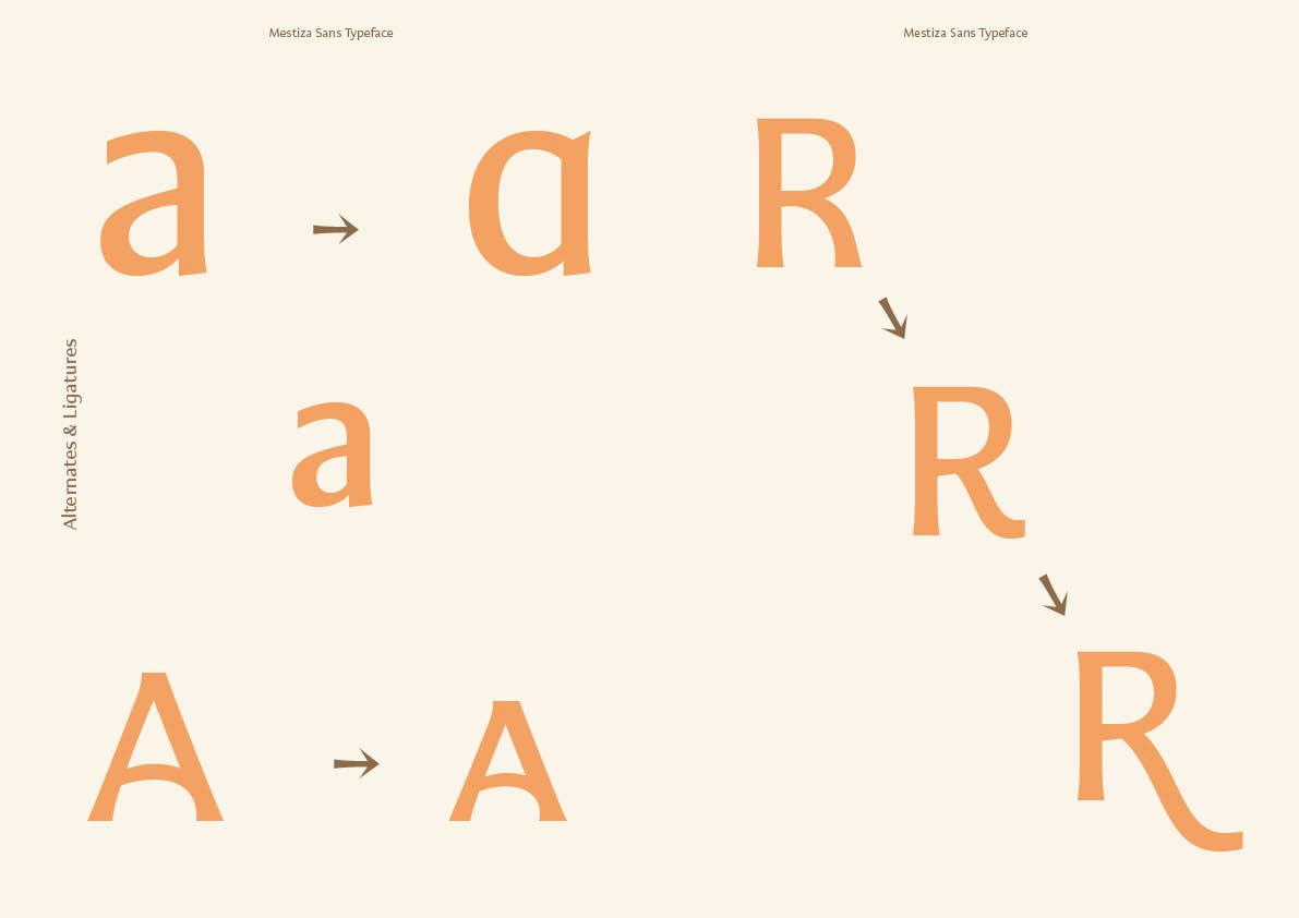
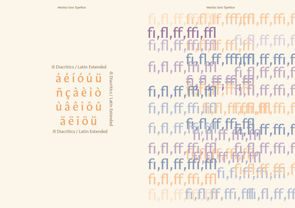
Throughout the publication, the typeface is showcased across multiple weights and styles including regular, italic, bold, and bold italic, while demonstrating its extensive character set, ligatures, numerals, and multilingual support.
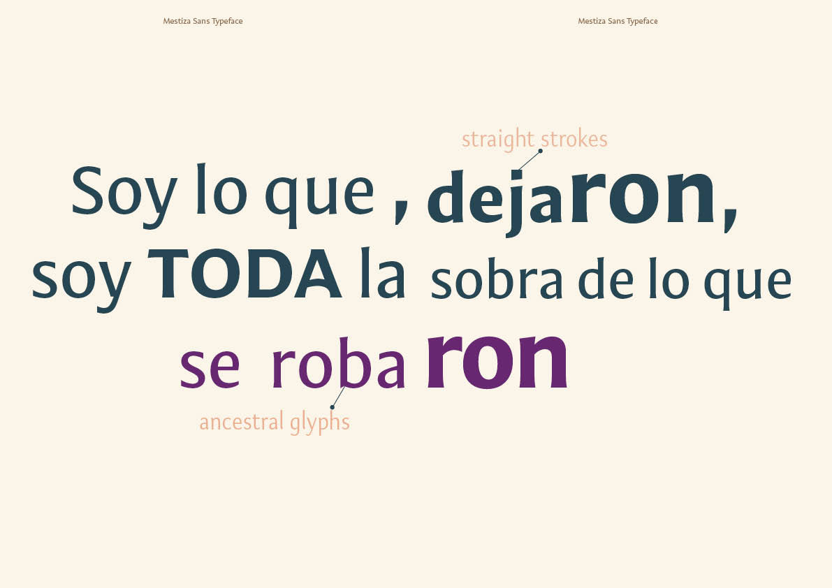
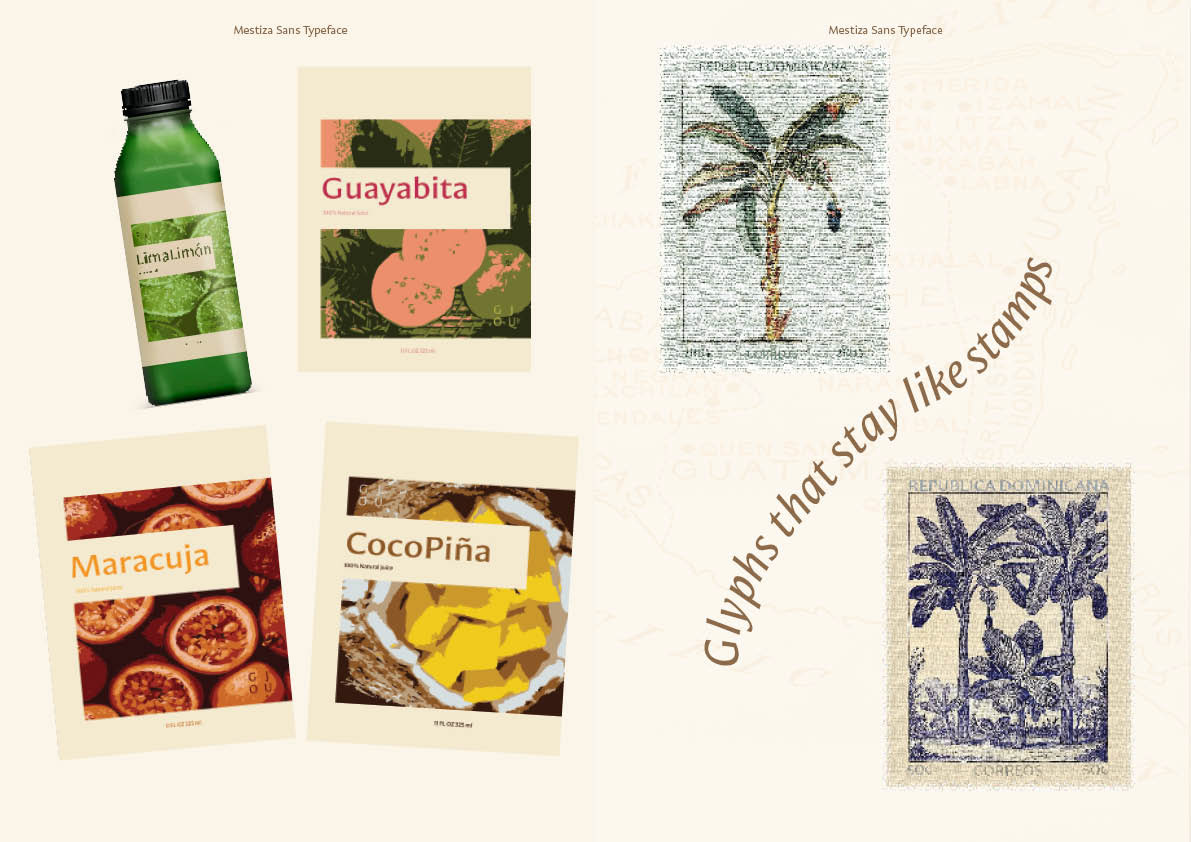
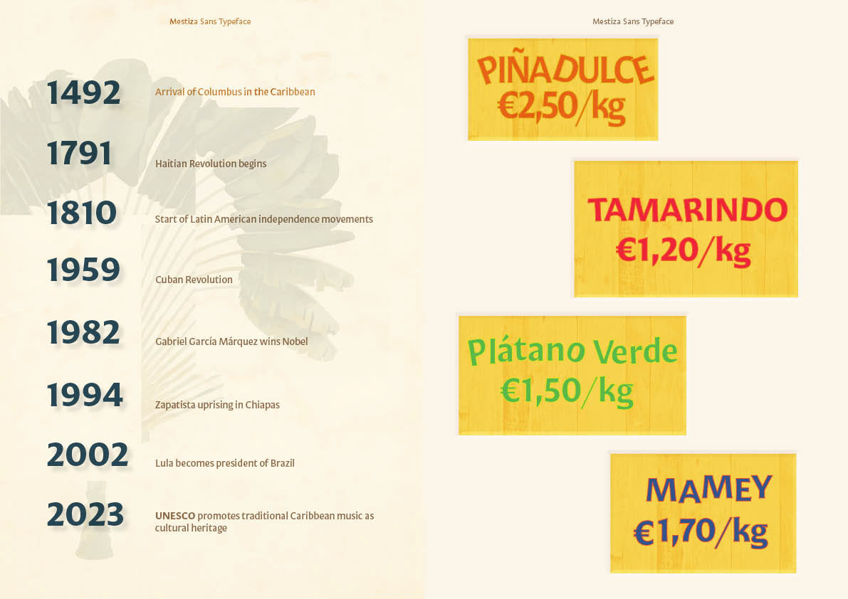
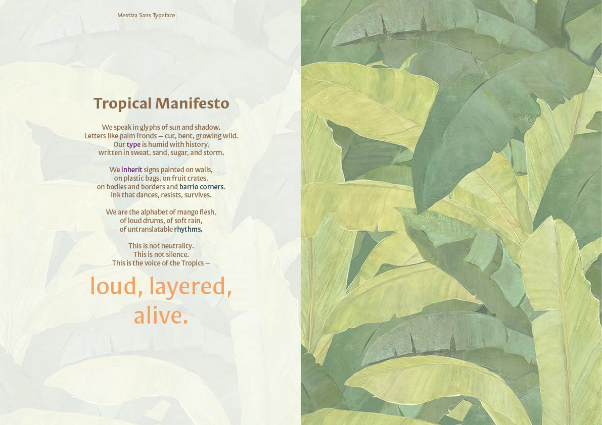
The editorial concept draws inspiration from Latin American visual culture: hand-painted market signage, colonial architectural lettering, indigenous glyph systems, and Caribbean graphic traditions. Visual compositions reference tropical markets, stamps, poetry, and historical timelines, framing the typeface within a broader cultural and historical narrative.
The publication culminates in a typographic manifesto that positions the alphabet as a living cultural artifact, “the voice of the tropics: loud, layered, alive.”
Key Elements
- Editorial layout and typographic hierarchy
- Exploration of Mestiza Sans weights and styles
- Ligatures, alternates, numerals, and multilingual characters
- Cultural narrative through typography
- Experimental typographic compositions
- Visual references to Caribbean and Latin American graphic culture
- Typographic manifesto and storytelling